
Somur identity and website
Complete creation of the Somur brand, including positioning, visual identity, language, and digital experience. The project encompasses everything from graphics and typography system to the design and implementation of the website on Framer, focusing on strategic consulting for purpose-driven businesses.
Services
Brand strategy
Logo design
Brand guidelines
Year
2025
Client
Somur Design

Somur is a strategic design consultancy that connects creativity, social impact, and future thinking. I was responsible for leading the entire brand building process - from positioning to the development of the visual identity and the corporate website. In this case study, I share the strategic, visual, and technical decisions behind the project, including the creation of the brand's visual language, the design of the digital experience, and the implementation of the site on Framer, with complete prototyping done in Figma. _______ To build a consultative, accessible brand with a strong identity, capable of attracting creative businesses and entrepreneurs seeking positive impact. The challenge involved uniting an inspiring brand narrative with a functional and scalable platform that reflects Somur's values: collaboration, vision, and responsibility.
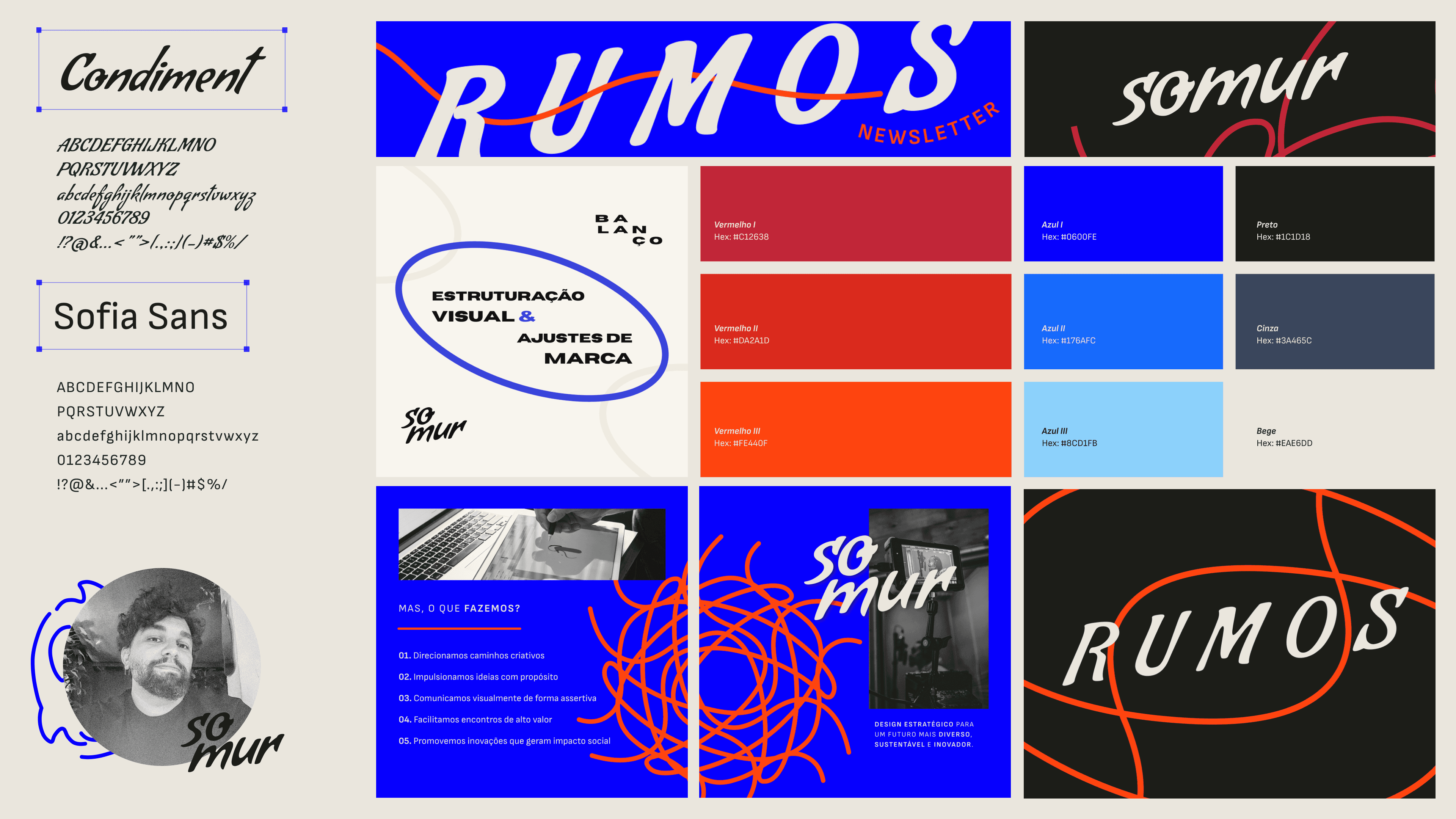
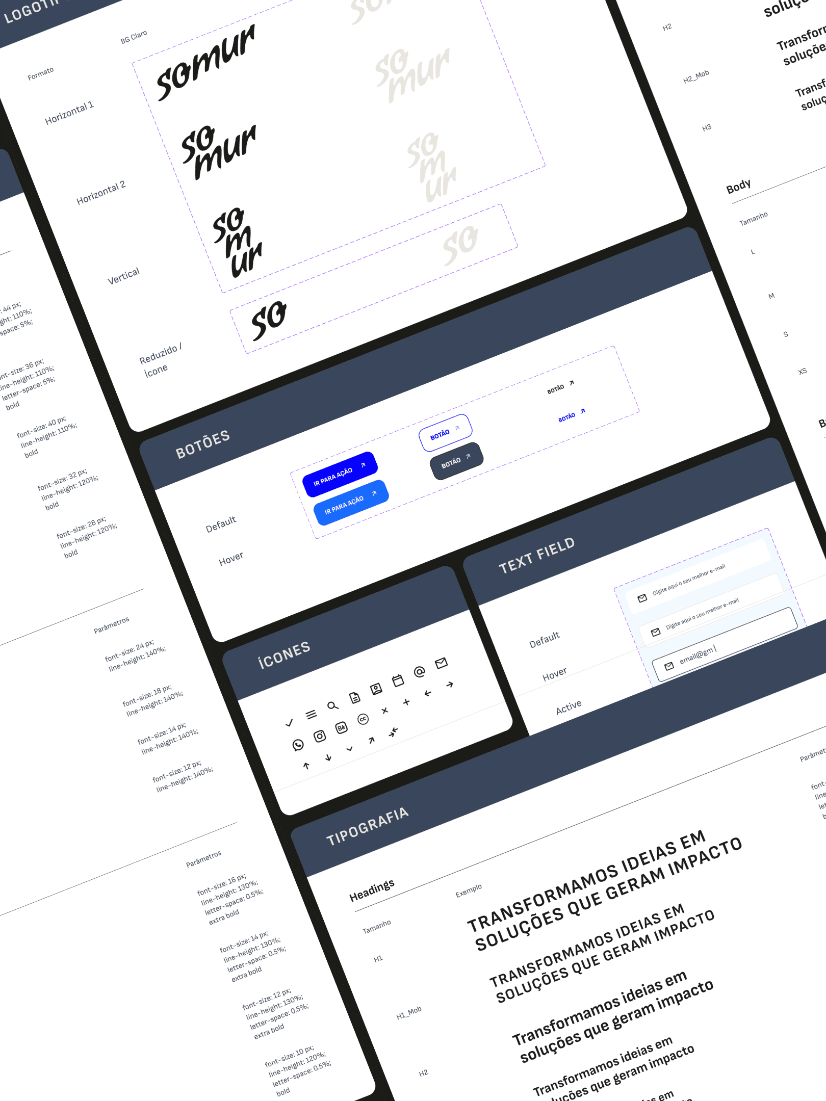
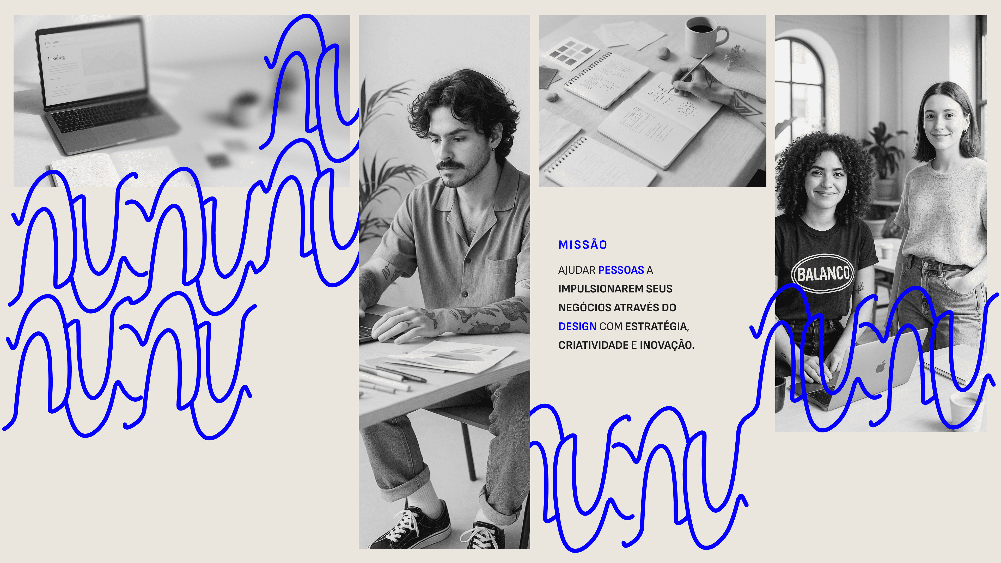
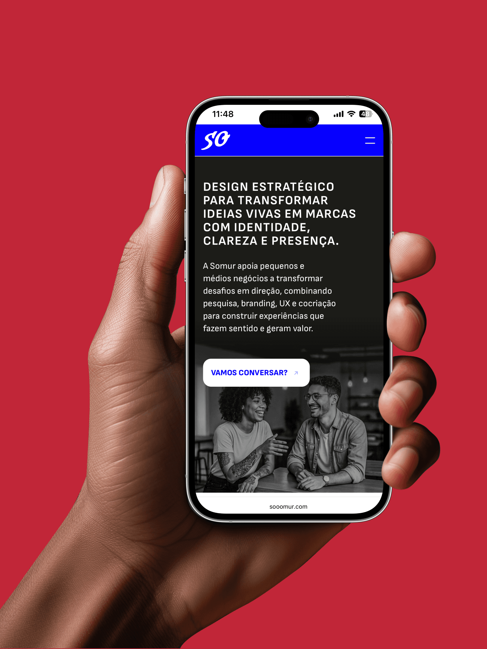
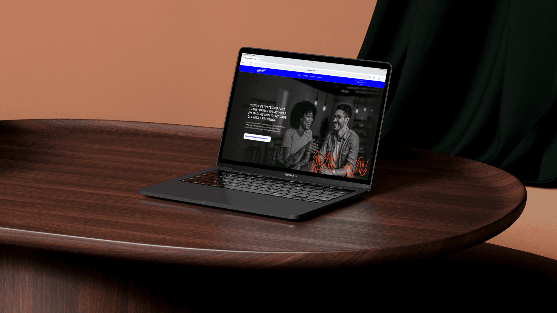
Strategic Positioning Somur was designed to act as a purpose-driven business partner, focusing on areas like art, fashion, culture, education, and social innovation. We defined a tone of voice that balances inspiration and professionalism, with a plural and realistic persona: people who want to transform and also make things happen. Visual Identity I developed the brand's visual system based on custom typography, a vibrant palette, and organic graphics. The typography Condiment (logo) and Sofia Sans (communication) ensure contrast between the authorial and the functional. The palette blends warm and deep colors (reds) with confident and digital tones (blues), balanced by grays and black, bringing accessibility and personality. The graphics were derived from fragments of the font, creating a lively visual universe connected to the name. Website Design and Development I created the responsive layout in Figma and implemented the complete site in Framer, including: • Subtle animations to reinforce identity • Content structure designed around flows (About, Services, Projects, and Contact) • Clear calls for conversion and newsletter signup • Cohesive visual system with the brand book The result is a refreshing digital experience, balancing visual impact and functional clarity.
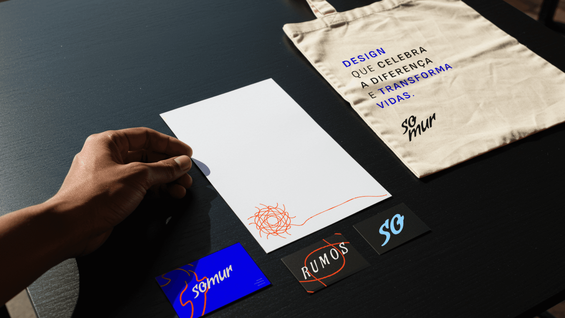

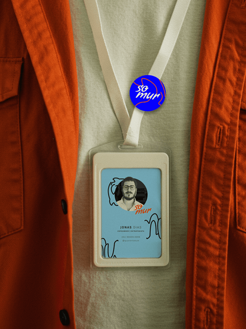
Main deliverables: • Naming and positioning • Visual identity and brand manual • Typography system and color palette • Proprietary graphics and institutional applications • UI Design of the website (Figma) • Complete implementation in Framer (desktop + mobile) • Content guidelines and tone of voice • Planning and publishing of the newsletter on Substack