
Discovery for B2B portal
Research project for optimizing a relationship portal in the construction sector. I led user interviews, journey mapping, and hypothesis structuring, delivering strategic inputs for product restructuring.
Services
Product Design
Discovery
User Journey
Year
2022
Client
Saint-Gobain Brazil

About the project: The Construction Partner is an educational platform focused on the construction industry. Alongside other improvement actions for the app, we diagnosed an opportunity to act on the main user capture screen, thus improving our acquisition process. Problem: Even after having undergone recent changes in its structure, the Home Page of the Construction Partner portal still presented specific problems such as a low conversion rate of new users, a high bounce rate, and specific difficulties in navigating the page. Expected outcome: • Reduce the bounce rate on the portal; • Decrease the number of questions via chat regarding new registration; • Improve the conversion rate of new users; • Decrease loading time of images on the Home page; • Improve course registration and search on the main page.
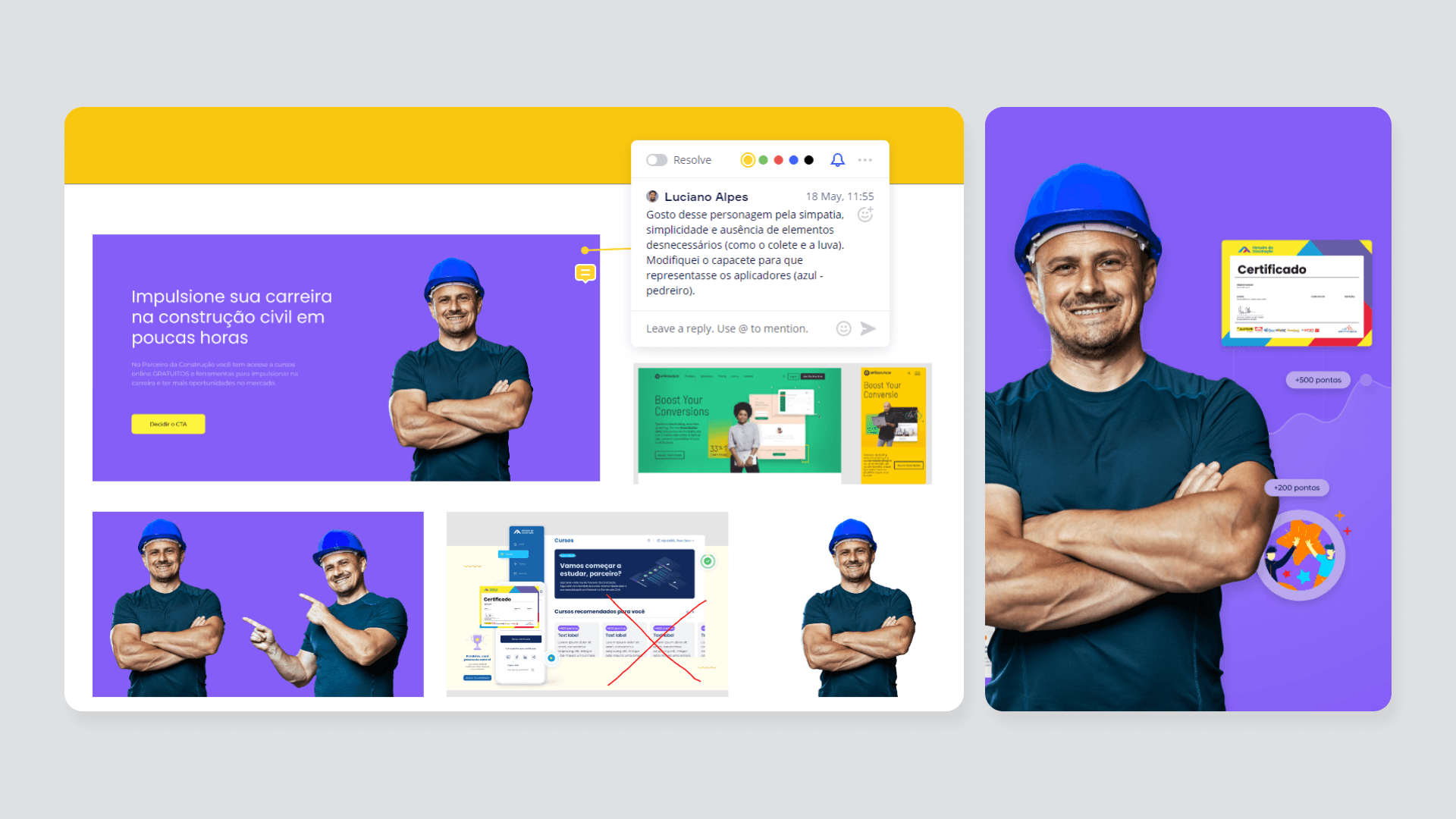
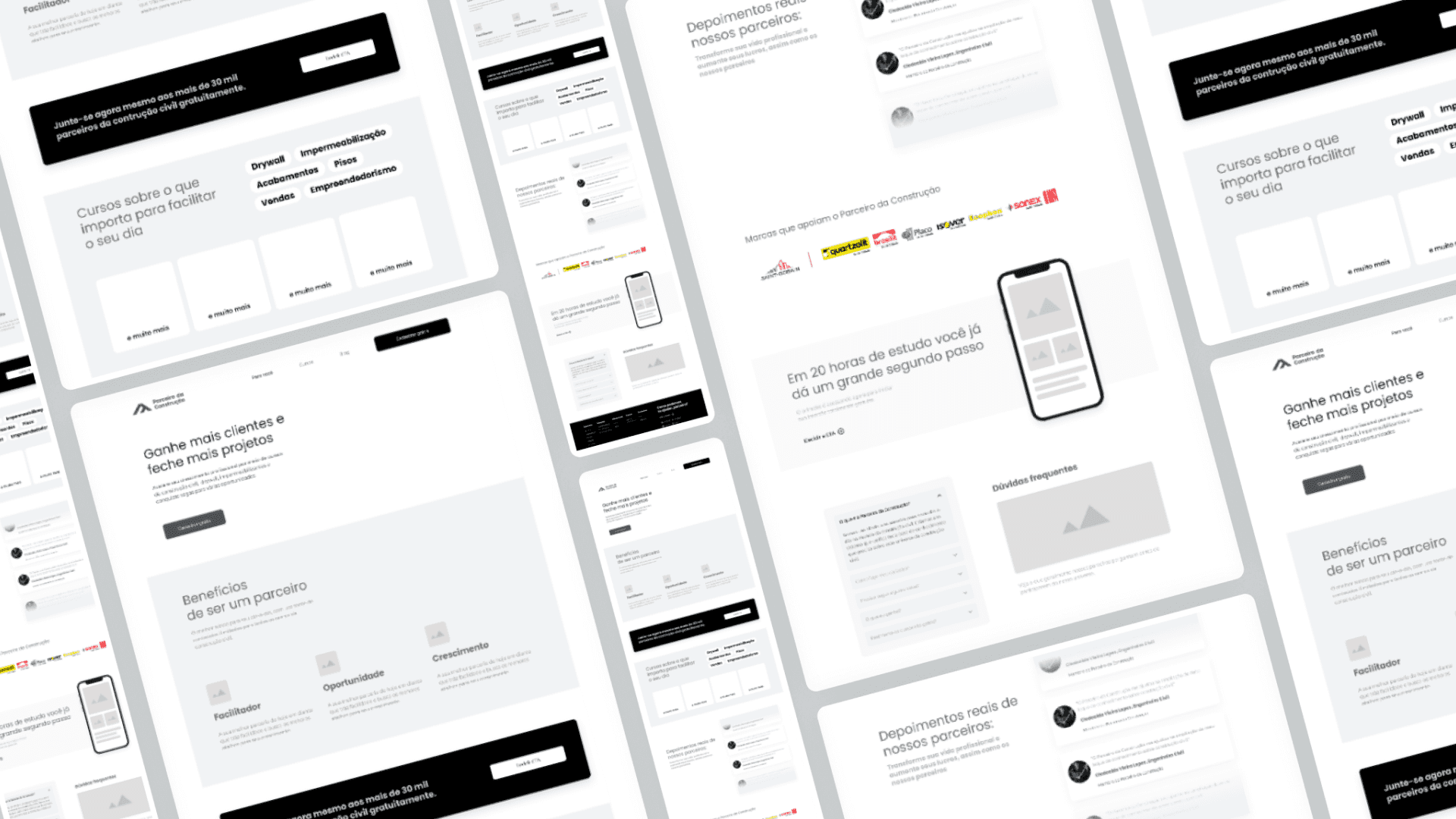
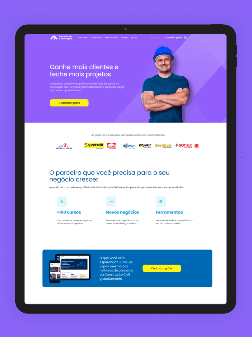
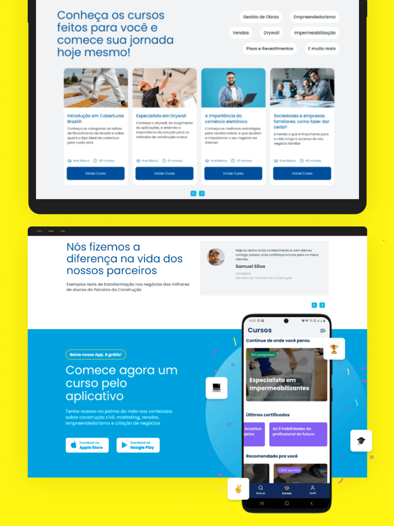
What needs to be done? Updating the Home Page of the portal, taking advantage of its existing structure (Webflow) and implementing high-impact, low-effort adjustments. Discovery: With the Discovery process already underway and after the stages of Benchmarking, Heuristic Assumption, and Data Analysis, we then suggest a reformulation of the base structure of the home by designing a new Wireframe and suggesting visual elements that could create a closer connection with the user. Completed stages: • Deepening the heuristic assumptions on the home • Monitoring user interaction with the page via Hotjar • Gathering new user testimonials as social proof (including the user's photo) • Defining and unifying signup CTAs after testing stages via G. Optimize • Redesigning the banner on the first fold of the home, bringing more humanization through the use of a character • Monitoring bounce rates and conversion after initial modifications via G. Analytics • Updating the mockups with more recent and realistic app screens (reducing the use of illustrations) • Removing > redirecting broken links in the menu
Ideation and Experiment: With all the visual elements ready, we brought everything to Webflow and decided to launch the new features in stages with the aim of separately tracking their performance. All results presented below are based ONLY on the launch of the banner on the first fold of the homepage. Due to internal client constraints, we had to pause the release of improvements, even with all the elements already ready to be validated with the user. Results achieved (First stage): • Monitoring the bounce rates after initial modifications (banner 1st fold): Decrease from 86.97% to 61.32% • In addition to the improvement in the bounce rate of the homepage, we also saw an improvement on the “Courses for Construction” page after some fine layout adjustments: From 94.27% to 58.70% • Improvement in course registration through Webflow with ease of management by the team, resulting in better navigation for the end user in the future • Responsiveness adjustments (mobile and other screens) • Inclusion of FAQ through CMS (+ autonomy for the team)

Technical sheet: • Luciano Alpes and Lídia Carvalho (Product Designers) • Camila Fraga (Product Manager) • Laís Lima (Associate Product Manager) • Hugo Mouto (Head of Product) Tools used: • Discovery: Miro • Documentation: Notion • Ideation: Figma and Webflow • Metrics and Data: Google Analytics, Optimize, and Hotjar.